
Logos are unavoidable to the local and mass consumer and it is usually those logos that create instant associations between logo design and product. This helps people feel more familiar with the companies they use, just as much as the logos speak for the companies themselves.
Many successful companies have spent over a million and some have spent absolutely nothing for their Brand Logo.
The cost of the perfect logo generally includes design, trademarking, legal protection, and even the occasional legal consultation or rebranding. Let’s take a look at five of the companies that have paid top dollars for their logos.
Top 5 Most Expensive Logos
1) Symantec
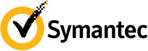
Starting off huge, it seems that Symantec Brand & Acquisition comes in as the most expensive logo ever created, costing a major $1,280,000,000.00! Included in this huge cost is the incorporation of the VeriSign logo into their original design as a rebranding move when they absorbed the company.
Now, the new logo holds elements of the original Symantec logo with the VeriSign logo checkmark now incorporated as a way to represent both companies.
2) British Petroleum
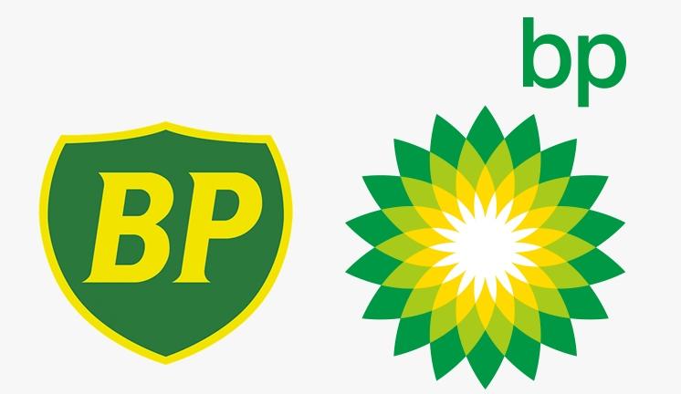
In 2000, British Petroleum paid a reported $210,000,000.00 for a rebranding move in order for the company to appear more environmentally friendly.
In order to do so, they added shades of yellow and green to represent the colours of the environment they were advertising to protect.
Quite ironically, BP is also responsible for the biggest and most devastating oil spills in history. This leaves British Petroleum in showing that they are environmentally friendly.
Instead of a beautiful, environmentally conscious logo, it now stands as a symbol of natural disaster and carelessness.
3) Accenture
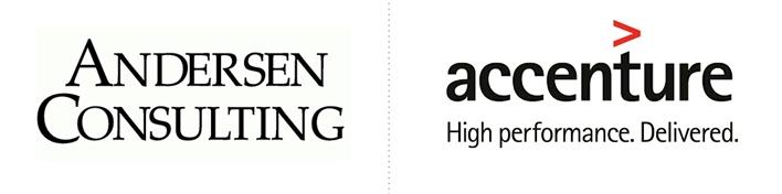
At times, rebranding is absolutely necessary for legal reasons, and that brings us to Accenture who paid $100,000,000.00 in order to create their logo after parting with a company known as Anderson Consulting. They were made to re-brand and redesign as an agreement to split.
However, there is a lot of criticism on this logo. Many people feel that such a high price is a mockery to the simplicity of the logo and that it leaves no real impression, or that meaning is lost in the lowercase letters and plain colours. Even though the company stands behind its design, critics do not.
4) BBC
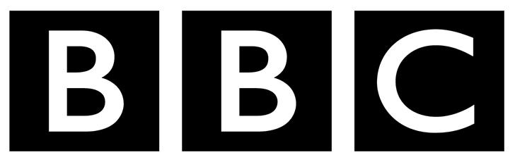
Moving down the list, we find the British Broadcasting Corporation – better known as BBC. The logo cost here is that of $1,800,000.00 and stands as one of the record holders for the longest-used logo in history, twice over. BBC last changed its logo in 1997 and before that, they hadn’t changed their logo since 1988.
The new logo was changed from black and white to purple tones with white letters. Even with the change, BBC is still one of the most universally recognizable logos which is said to make the cost absolutely worth it.
5) Pepsi
Lastly, we have the Pepsi Logo coming in at $1,000,000.00. This comes in after their re-branding which was rumoured to be a challenge to Coca-Cola. The notable mention for Pepsi’s redesign is that it costs so much for such a slight change.
The red is the more prominent colour now, the white stripe is now slanted and more of drop shape and the background has been changed from white to dark blue.
Some question the cost of the logo since it remains quite similar to the original, but Pepsi stands behind its decision to upgrade their look.
Final Thoughts
On the opposite end of the spectrum, one could look at some of the lowest costing logos of all time most of which would surprise you. But also have reasonable answers to explain those low costs.
Nike, for instance, only spent a mere $35 on their logo when founder Phil Knight purchased the ‘swoosh’ from a graphic design student.
Perhaps some of the bigger surprises are that of Microsoft and Google both costing absolutely nothing to create. Google’s logo was created on an editing app by its co-founder, and Microsoft has its own team to generate their logo.
The point here is that no matter the cost of the logo, when it is well designed and used thoroughly and consistently, the right logo can take your business a long way.
Also Read: