
The footer is a cross-cutting element of a website which is located at the bottom of the page. Footer is especially useful for giving additional information or as a tool to collect leads.
As a rule, there must be only one footer for all the web pages, therefore it must contain general information about the company, goods, or services.
High-quality stylish footer design will not only attract new potential customers and help in SEO optimization but also improve the appearance of the site by organizing its content. Here in this article, we will discuss the best practices to follow before designing a website footer.
Determine the size of the Footer and the basic elements
The placement of each item must be carried out by the importance to the reader. For example, a block with contacts of an organization is usually located in the right corner or the center.
Define hierarchy
The visitor should be able to quickly see the necessary information and not get confused about it. Columns, large fonts, and good typography will make your footer effective.
Simulate lists
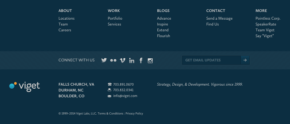
To ensure better readability of information, all links of website footers should be grouped into separate columns.
Large indents and proper spacing will improve clarity and focus. It is recommended to allocate more free space for the headings in each column than for the items on the list.
Separate the footer from the rest of the content
It should be completely different from the main body of the page. For this, it is better to use much darker background than the one used above. The contrast will grab the reader’s attention and emphasize important information. You can use an unusual design with additional graphic elements.
Use spaces
The presence of white space allows you to pay attention to each block of the footer. Spaces are used to separate the top of the footer from their content.
Choose fonts that match the website design
Add brightness to the main elements, and muffle the rest in website animations. This will allow you to correctly place accents and focus the reader’s attention on something specific.
When creating a spectacular footer, do not forget about a single design style. The main task of the webmaster is to design the footer in such a way that it should match with the design of the entire site as a whole.
You shouldn’t add unnecessary links in the footer. It is quite simple to determine the uselessness of the posted information: if it does not fit logically to the categories, then, most likely, remove it.
Common web design mistakes that make footers useless
The most common mistakes aspiring web designers and experienced professionals make:
- Blurred names of transitions and lack of a clear thematic link. This can spoil even the best animation effects for websites.
- Small unreadable font. Trying to “stick” as much information into the footer as possible, it is important to use clear and bigger fonts.
- Multilevel sitemap. Expanded navigation is a useful solution, but it is a mistake to place a large sitemap with more than two levels.
- Excessive creativity. First of all, the footer is the area where the users search for additional information, so it is important to strike a balance between creativity and functionality.
Footer is an important element of a website. Making it as effective as possible is easy enough. The most important thing is information and the high-quality design since every information on the site contributes in adding loyalty among visitors and can become the key in lead generation.
Also Read: